[Last Updated: 1/8/2025]
This article shows you, step by step, how to create a dynamic inter-asset correlation matrix using Google Sheets. Then, we’ll look into making it more understandable using Conditional Formatting and Bar Charts.
If you’d like access to the spreadsheet, please sign up for the Quantastic Research newsletter and send a subsequent email to quantasticresearch.blog@gmail.com.
Step 1: Setting Up the Sheets
The first step is to set up the spreadsheets. To do this, we’ll use the GOOGLEFINANCE function provided by Google Sheets.
We’re going to create three sheets. The first is called Correlation, the second is called Data, and the third is called Parameters.
The Correlation sheet will contain the list of Tickers we want to run a correlation on.
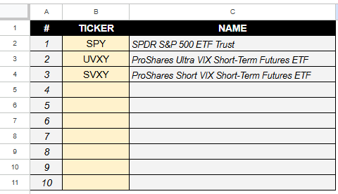
Cell C2 has the following formula. To apply to the rest, simply click and drag, or double click the blue dot that appears in the bottom right corner of the cell.
=IFNA(GOOGLEFINANCE(B2, "name"), "")The Parameters sheet will hold the following parameters for data collection:
- End Date
- Number of Years
The end date is the date up to which the data will be imported into Google Sheets. The number of years is the number of years since that ending date to import.
For example, if today is January 8th, 2025 and I want to run a correlation on the last year of stock data, then I would put 1/8/2025 as the End Date and 1 for Number of Years.

Step 2: Import the Data
Now we’re going to import the data. For now, we’re going to focus on importing the data from the first stock ticker in the list (for us, that’s SPY).
Navigate to the Data spreadsheet. In cell A2, use this formula to extract the ticker from the Correlations sheet:
=Correlations!B2To add the name of the equity, populate B2 with the following:
=Correlations!C2You should have:
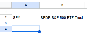
Now, we’re going to skip a row to separate the data and populate cell A4 with the following formula:
=GOOGLEFINANCE(A2,"close",Parameters!$B$3-(365*Parameters!$B$2),Parameters!$B$3, "DAILY")The formula above does the following:
- Refers to the ticker symbol in cell A2.
- Finds all the closing prices (see the “close” keyword in the second argument)
- Computes the starting date from the parameters given in the Parameters sheet. That computation involves taking the end date and subtracting the number of days (365 * number of years).
- The ending date is given in cell B3 of the Parameters sheet.
- We are only considering “DAILY” price data.
It should populate the following:

Step 3: Building the Correlation Matrix
Now it’s time to build the correlation matrix!
Navigate to the Correlations sheet and create the skeleton for the correlation matrix. Column E is just basic text (Ticker 1, Ticker 2, etc.). Row 1 is the same.
Column F has locked references to the Ticker list in column B ($B$2, $B$3, etc.). This allows you to copy and paste the contents using CTRL+C and, in cell G3, right click -> Paste Special -> Transpose.

We know that the diagonals should be all ones, so let’s do that now. I also added some borders to better view the correlation coefficients.

Using Named Ranges
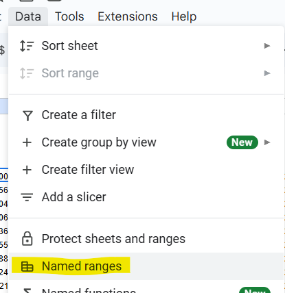
Now, this goes a lot smoother if we use Named Ranges. Navigate to the Data spreadsheet. Then, from the top menu, select Named Ranges.
We’re going to name the Close price data in column B “TICKER1”. The range starts at B5 and extends all the way to the bottom of the spreadsheet.
Click Add a Range. Then name it and specify the range.
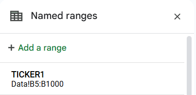
Do this for the second ticker, third ticker, and so on.
When you’re finished naming the ranges, go back to the Correlations sheet.
Computing the Correlations
In cell G4, use the following formula:
=IFERROR(CORREL(TICKER1,TICKER2),"")The CORREL function computes the correlation coefficient between two datasets. In this case, TICKER1 (SPY closing data) and TICKER2 (UVXY closing data) are being fed into the correlation function.
The IFERROR part makes it so nothing is displayed if there is an error computing the correlation between the data sets. I find that it makes for a cleaner spreadsheet.
You should get something similar to the following:

As you may know, the upper triangle is just a reflection of the bottom half. For example, the correlation between Ticker 1 vs. Ticker 2 is the same as the correlation between Ticker 2 vs. Ticker 1. You can choose whether you’d like to populate those cell with references to the corresponding cells in the lower triangle.
Here’s what it looks like with those cells populated. I’ve added a few more stocks to hit the point home:

Step 4: Visualizing the Matrix
When you use a correlation matrix, you usually are searching for how much a given asset is correlated with the others. You can use the correlation matrix above as-is, but it’s quite hard to visualize at glance.
There are a couple methods we can use to get a better sense of the data.
Conditional Formatting
Highlight the matrix cells (F3:P12).

Then, in the top menu, go to Format > Conditional Formatting:
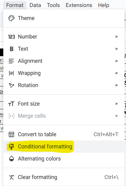
The Conditional Formatting tool should appear on the right. Click on Color Scale. You should notice the cells changed their color to various shades of green:

For some, this is good enough. Personally, I like to style the correlation matrix using red for negative values and green for positive values.
To do this, click on the Preview and select the “Red to white to green” option. Then, change Minpoint to “Number” and set it to -1. Change Midpoint to “Number” and set it to 0. Change Maxpoint to “Number and set it to 1.
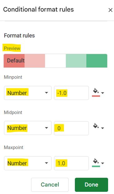
The result is much easier to navigate:

Bar Charts
Let’s say you built the matrix above with the intention to research the correlations in comparison a specific stock (say, SPY).
We can build a bar chart that only shows the correlations with the ticker of interest. To do this, we’re going to add a feature to the Correlation sheet.
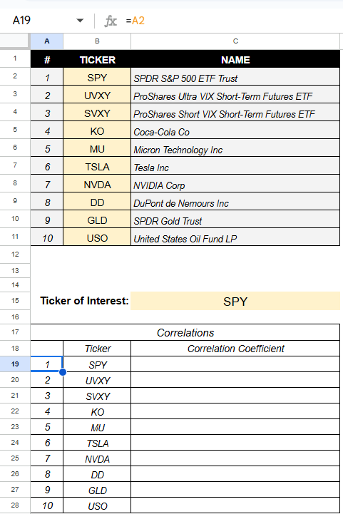
Define a cell that will hold the Ticker of Interest, which is a ticker that already exists in the original Ticker list.

Then, create a table underneath the Ticker of Interest. The cells from A19 to A28 are referencing cells A2 through A11, while the cells from B19 to B28 reference the cells B2 through B11:
Using VLOOKUP to Extract the Inter-Asset Correlations
Now pay attention. Cells C19 through C28 will hold the correlations that compare only the ticker of interest with the tickers in column B.
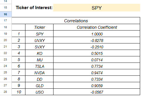
The formula in C19 is:
=IFNA(VLOOKUP($C$15,$F$3:$P$12,A19+1,false))The core part of this line is the VLOOKUP function. The first argument is the “lookup” value, which is the ticker of interest (in this case, SPY).
The second argument is the range from which we are extracting a value. This includes the correlation matrix with the addition of the tickers in column F. It’s important to include the tickers in column F because that is what the VLOOKUP function is using to extract the corresponding correlation values.

The third argument is the column we are extracting from within the range (Figure 22, bounded in red). The first column is always column 1, so the correlation values are held in columns 2 through 11. This is why the third argument is A19+1.
Creating the Bar Chart
To create the Bar Chart, highlight cells B18:C28. Then, in the top menu, go to Insert > Chart. The default chart should be something like a bar chart. You can change the name, style, and other aspects of the chart in the chart settings:
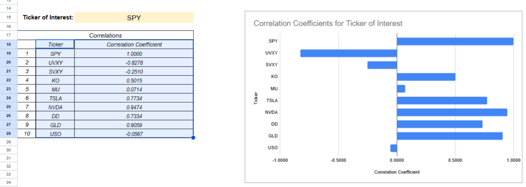
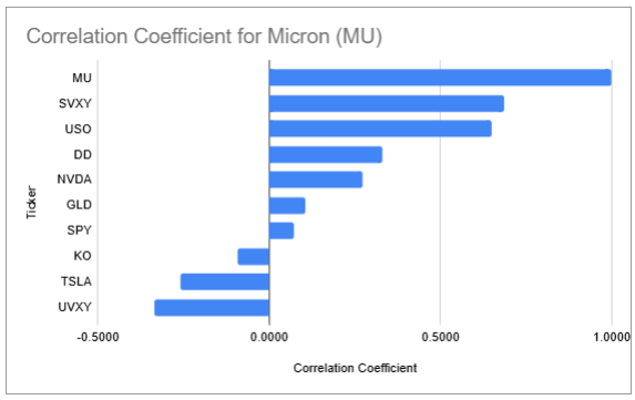
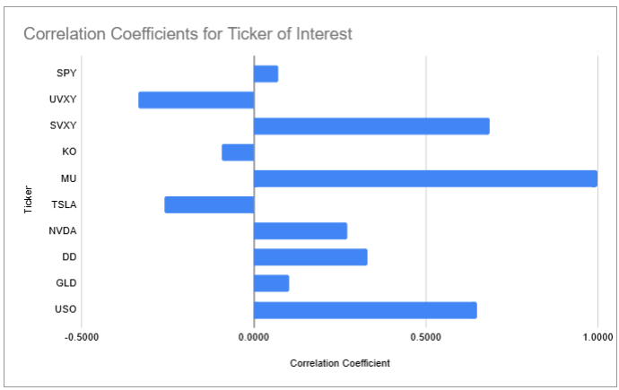
Now, you can change the “Ticker of Interest” and the chart will update automatically with the corresponding correlations. Here it is for Micron (MU):
Creating a Bar Chart with Sorted Correlations
You can also sort them using the SORT function:
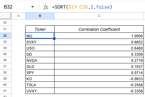
And build a bar chart based on range B31:C41 instead:
